It's been over 3 weeks since I rushed the HVLP spray finish on my first guitar the night before I took it up to the GAL Convention. I wasn't proud to show off such a lousy looking finish, I can tell you - it was orange peel o'rama!
Anyway, I decided to spend a few hours this past weekend sorting it out since the waterbourne acrylic finish should be well cured by now. I took off the neck (it's a bolt on job, so that's easy!), then wet sanded ("spit") everything first at 600, then 800, 1000, 1500, 2000, and 2500 grits. It took a LOT of work (and sandpaper!) to get it level at 600 grit, but by the time I got to 2500 grit, it was starting to look like the hours of hand sanding were going to be worth it.
The previous weekend, I had rigged up one of those Shop Fox buffing wheel arbours with an old 1/3HP motor that I had lying around. I changed the 27" belt (that Shop Fox supplied with the arbour) to the longest one I could find at Kragen Auto Parts and made a kind of buffing "tower" with lots of clearance around the buffing wheels. I'll post some photos of this later.
Since I was already at 2500 grit, I skipped the "fine" buffing compound and just hit the guitar with the "very fine" and "finest" compounds. Wow, was I gobsmacked!? The guitar positively SHONE now. It had been transfomed from an "also ran" to something that people did a double take on when they saw it! I can't believe the difference.....see what you think:
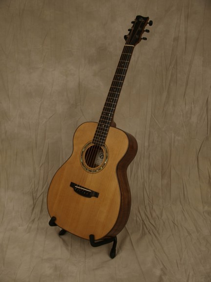
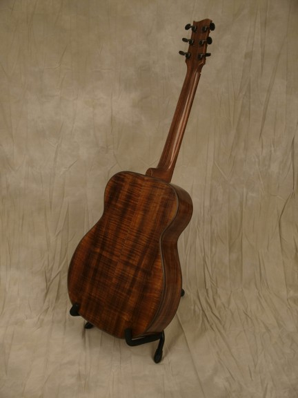
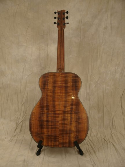
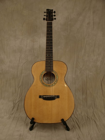
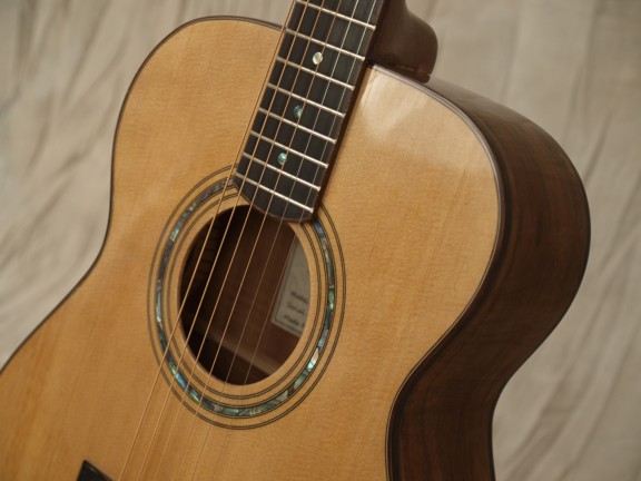
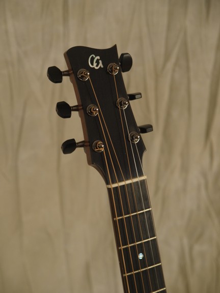
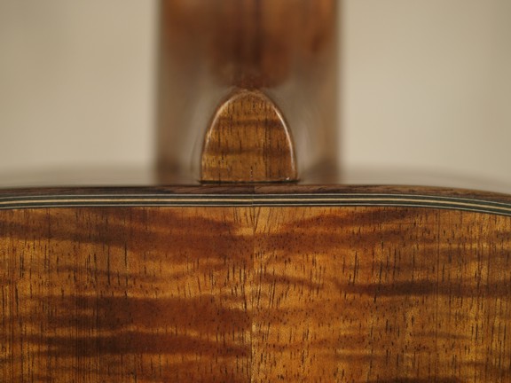
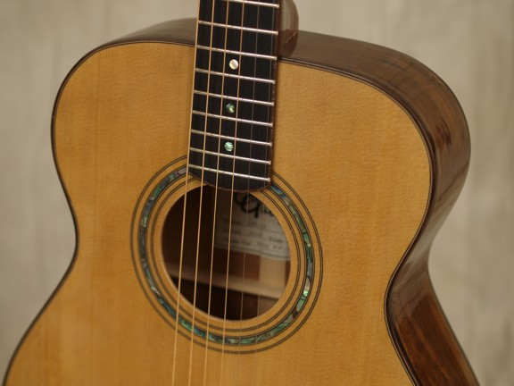
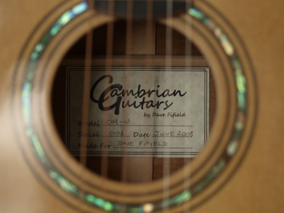
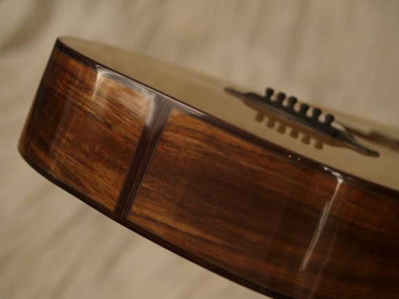
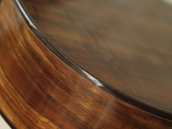
Click on the pictures to see them in full resolution. I learned a few things about taking photos of guitars tonight too:
1. Iron your backdrop!

2. Set your camera to its maximum possible resolution!

3. More light!

I'll get better at this stuff, promise! Does anyone have any tips for how to show off the mirror-finish shine on a guitar in photos? Mine show the reflection of my umbrella light reflectors quite nicely, but the photos don't look right to me.....
Cheers,
Dave F.