Official Luthiers Forum! http://w-ww.luthiersforum.com/forum/ |
|
My idea for a replacement for a Maker's sticker http://w-ww.luthiersforum.com/forum/viewtopic.php?f=10101&t=55224 |
Page 1 of 1 |
Author: | guitarmaker78 [ Mon Aug 29, 2022 10:05 pm ] |
Post subject: | My idea for a replacement for a Maker's sticker |
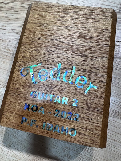
I decided to step up my game for my second build so I came up with this on my neck block. I was originally going to make a sticker, but I like doing things that make others say "why the hell would he do that?" This project took about 5 hours to make the block, program the CNC for the neck block milling, mill the neck block, program the CNC cut file for the pearl, cut the pearl letters, correct the programming for some of the pearl letters, cut the remaining pearl letters, set and glue the pearl. I expect the next one to take about 2 hours start to finish. Most of the work was programming the CNC and I won't have to do that next time. |
Author: | Colleen_M [ Mon Aug 29, 2022 10:19 pm ] |
Post subject: | Re: My idea for a replacement for a Maker's sticker |
Very nice! Certainly unique. My version of “stepping up my game” is buying tools that I need, and some just to make my experience easier (like a drill press and, tomorrow, a belt/spindle sander. But then, I’m just on my first guitar. I made a violin years ago using only hand tools. |
Author: | Chris Pile [ Mon Aug 29, 2022 11:54 pm ] |
Post subject: | Re: My idea for a replacement for a Maker's sticker |
That is beautiful - absolutely worth it. |
Author: | Woodie G [ Tue Aug 30, 2022 3:49 am ] |
Post subject: | Re: My idea for a replacement for a Maker's sticker |
I've never cared for shell on a grained wood without a fine border of some sort - the eye seems to appreciate a definitive border between shell and not-shell. I believe insetting an ebony veneer panel to frame the shell would present a much more finished look... perhaps inset 3/16" from the edges of the neck block with the corners handled with a decorative cove or something similar. Your photo is an illustration of just how much harder the eye must work where a defined border around each letter is not available... the text is actually quite difficult to read at the light angle seen in the shot. Another factor is the width of the shell letters... thinner characters look better... it's the reason why 1/16" shell purfling is as wide as I would go on something like a dreadnaught top, and closer to 0.040" would be nice for a smaller body. With CNC-cut pockets and shell, there's no reason for the same wider, chunkier letters that are easier to produce when hand cutting the shell. |
Author: | DennisK [ Tue Aug 30, 2022 8:07 am ] |
Post subject: | Re: My idea for a replacement for a Maker's sticker |
Personally I like the wide letters, but I do agree that it's hard to read as is. You could make a perfect outline by cutting an expanded copy of the letters at shallower depth and gluing them in with colored epoxy. |
Author: | jfmckenna [ Tue Aug 30, 2022 8:43 am ] |
Post subject: | Re: My idea for a replacement for a Maker's sticker |
Neat! Never seen that done before. |
Author: | guitarmaker78 [ Tue Aug 30, 2022 10:25 am ] |
Post subject: | Re: My idea for a replacement for a Maker's sticker |
Woodie G wrote: I believe insetting an ebony veneer panel to frame the shell would present a much more finished look... perhaps inset 3/16" from the edges of the neck block with the corners handled with a decorative cove or something similar. Good idea. I may try that if I do another one. It's actually quite easy to read in person, though. Woodie G wrote: Another factor is the width of the shell letters... thinner characters look better... it's the reason why 1/16" shell purfling is as wide as I would go on something like a dreadnaught top, and closer to 0.040" would be nice for a smaller body. With CNC-cut pockets and shell, there's no reason for the same wider, chunkier letters that are easier to produce when hand cutting the shell. The CNC is specifically why I had to go with the chunky letters. I’m limited by a 1/32” bit. I had to change the font, bolden it, and scale it larger to make this work. There are places in the pocket operation and the letter contour operation where the bit wouldn't fit, otherwise. |
Author: | guitarmaker78 [ Tue Aug 30, 2022 10:30 am ] |
Post subject: | Re: My idea for a replacement for a Maker's sticker |
duplicate post |
Author: | guitarmaker78 [ Tue Aug 30, 2022 10:32 am ] |
Post subject: | Re: My idea for a replacement for a Maker's sticker |
DennisK wrote: You could make a perfect outline by cutting an expanded copy of the letters at shallower depth and gluing them in with colored epoxy. That's a good idea. I'd have to make the letters larger in order to do so since the bit was already barely able to fit in some spaces. For instance, inside the 'P' would need outlined too and I would have to enlarge the font to do so. Space was my nemesis on this project. |
Author: | JimWomack [ Tue Aug 30, 2022 10:36 am ] |
Post subject: | Re: My idea for a replacement for a Maker's sticker |
Why the hell would you do that? ... Seriously, that looks great. Nice CNC run. |
Author: | DennisK [ Tue Aug 30, 2022 3:14 pm ] |
Post subject: | Re: My idea for a replacement for a Maker's sticker |
guitarmaker78 wrote: DennisK wrote: You could make a perfect outline by cutting an expanded copy of the letters at shallower depth and gluing them in with colored epoxy. That's a good idea. I'd have to make the letters larger in order to do so since the bit was already barely able to fit in some spaces. For instance, inside the 'P' would need outlined too and I would have to enlarge the font to do so. Space was my nemesis on this project. Yeah, you might just fill those smallest holes completely with epoxy. But even tiny nibs of wood might not break off if the outline pocket is shallow enough. |
Author: | A.Hix [ Tue Aug 30, 2022 8:52 pm ] |
Post subject: | Re: My idea for a replacement for a Maker's sticker |
That looks great! |
Author: | Pegasusguitars [ Tue Aug 30, 2022 9:52 pm ] |
Post subject: | Re: My idea for a replacement for a Maker's sticker |
I'm surprized at the unnecessary heat you took on this post. No matter. People will love it.-Bob |
Author: | guitarmaker78 [ Tue Aug 30, 2022 10:19 pm ] |
Post subject: | Re: My idea for a replacement for a Maker's sticker |
Pegasusguitars wrote: People will love it.-Bob Thanks, Bob. I only plan to make them for me and my family/friends. I'll never sell them. I just enjoy guitars and this is a fun hobby. |
Author: | Clay S. [ Tue Aug 30, 2022 11:51 pm ] |
Post subject: | Re: My idea for a replacement for a Maker's sticker |
JimWomack wrote: Why the hell would you do that? ... Seriously, that looks great. Nice CNC run. I'll second that! When you build for yourself you can do what you want - looks great! |
Author: | Woodie G [ Thu Sep 01, 2022 6:49 am ] |
Post subject: | Re: My idea for a replacement for a Maker's sticker |
Pegasusguitars wrote: I'm surprized at the unnecessary heat you took on this post. No matter. People will love it.-Bob One would assume that someone seeking feedback on his or her work would also anticipate some constructive criticism, but if everyone here really wants to see a 60 year old cheerleader try to manage the routine she did in high school (and squeeze into that costume), I suppose I could offer something more in the way of 'goooOOOOOOOO Team!' next time around. But in the spirit of doubling down on bad behavior or bad policy so in vogue these days... For a logo, anything goes... thick/thin, squat characters, etc. Why? Because it is a design feature. Greenridge used a stylized G with a ragged font. Would that be the best font to use in standard text? Of course not - because that sort of supporting text is seldom part of the logo, and if it is, is usually somewhat simplified versus the rest of the logo (e.g., the Est. 1833 on the Martin headstock decal). So the font on your 'Tedder' is fine... thin, thick, skinny and loopy... as long as it looks a little less like standard font and more like something unique, those thicker letters add up to a logo. Your supporting text is something altogether different. Serial number, place of manufacture, materials, etc. all convey additional information that is meant to be READ, so using a blocky, difficult to interpret font on a very busy background works against that goal. Although somewhat mitigated with a neutral, contrasting background, there is a very good reason why the novel you might be reading uses body text that keeps the aspect ratio between letter height/width and the thickness of the bar and stem at or close to specific values. Text meant to be read for information tends toward fairly slim construction, with only the titles or similar accented text tending towards chunkier construction. You might also recognize that - while certain purveyors of over-roasted, over-priced, inexpertly brewed coffee may be able to eschew any text in their logo altogether, it was only after acculturating their customers both bad coffee and ubiquitous availability of same. I like the 'Tedder' part of things just fine, as it supports the sort of name recognition which may eventually end up with an '... ooh... is that a Tedder she's playing? GASP!!!' moment. The rest of the label could better support the logo with just a little more work and some time spent with Photoshop or similar to proof the work. In summary, decide what is logo and what is information, and consider readability and degree of recognition you may expect to see on the apart of the reader. |
Author: | Clay S. [ Thu Sep 01, 2022 7:28 am ] |
Post subject: | Re: My idea for a replacement for a Maker's sticker |
Hi Woodie, Sometimes people are just showing off their work and sharing ideas. I'm sure your criticism is well intentioned and for those seeking marketing advice- spot on. As for 60 year old cheerleaders - you might not be old enough to make the cut - https://www.youtube.com/watch?v=hJId5UO32D0 |
Author: | dzsmith [ Thu Sep 01, 2022 10:39 am ] |
Post subject: | Re: My idea for a replacement for a Maker's sticker |
Looks great Thomas! |
Author: | jfmckenna [ Thu Sep 01, 2022 1:01 pm ] |
Post subject: | Re: My idea for a replacement for a Maker's sticker |
guitarmaker78 wrote: Pegasusguitars wrote: People will love it.-Bob Thanks, Bob. I only plan to make them for me and my family/friends. I'll never sell them. I just enjoy guitars and this is a fun hobby. Once you find yourself with a shop, and a home, full of guitars you might reconsider that |
Author: | guitarmaker78 [ Thu Sep 01, 2022 6:13 pm ] |
Post subject: | Re: My idea for a replacement for a Maker's sticker |
jfmckenna wrote: guitarmaker78 wrote: Pegasusguitars wrote: People will love it.-Bob Thanks, Bob. I only plan to make them for me and my family/friends. I'll never sell them. I just enjoy guitars and this is a fun hobby. Once you find yourself with a shop, and a home, full of guitars you might reconsider that Haha. I already have all of those things. The Lord has blessed me enough that if I end up with extra guitars, they’ll be a gift for someone - family/friend/church/charity/etc. |
Author: | Terence Kennedy [ Thu Sep 01, 2022 7:44 pm ] |
Post subject: | Re: My idea for a replacement for a Maker's sticker |
That’s a cool idea. I second the recommendation to try a darker wood inlay next time. |
Author: | Bryan Bear [ Fri Sep 02, 2022 11:09 am ] |
Post subject: | Re: My idea for a replacement for a Maker's sticker |
It is always a bit tricky to know how to respond with critique and how it might be received. Some folks may want to just post their work and hear that people like it or hear nothing at all. Others may want to post their work and get feedback that helps them see what other perspectives they may not have considered. I’m in the second camp. I would much rather get a “that looks nice, have you considered X? I feel like X or sometimes even Y is helpful because of Z.” That helps me learn, develop my eye and get new ideas. In the past I have posted my work and specifically called out things I was unhappy with or thought could be better and asked for input. I usually got more responses saying not to point out my mistakes than I did alternate approaches. That said, you never want to come off as raining on someone’s parade if that is not what they are looking for. Like I said, it is tough. |
Author: | Hesh [ Fri Sep 02, 2022 11:33 am ] |
Post subject: | Re: My idea for a replacement for a Maker's sticker |
Don't know if this has been brought up yet but that is where many if not most people install their battery bag for a pick-up in an acoustic guitar. I don't install mine there but most of what comes into our shop is sadly installed there and then falls off. I know you said you have no intention of selling but I said that too and then built 54.5 and sold all 45 that were for sale. Most of my clients had me add pick-ups. I also gave three away and two of those got pick-ups so it's a consideration. It looks good, good job I just don't think you want it covered up someday by a cheap black bag with a 9V battery in it. |
Author: | guitarmaker78 [ Fri Sep 02, 2022 12:50 pm ] |
Post subject: | Re: My idea for a replacement for a Maker's sticker |
Bryan Bear wrote: It is always a bit tricky to know how to respond with critique and how it might be received. Some folks may want to just post their work and hear that people like it or hear nothing at all. Others may want to post their work and get feedback that helps them see what other perspectives they may not have considered. I’m in the second camp. I would much rather get a “that looks nice, have you considered X? I feel like X or sometimes even Y is helpful because of Z.” That helps me learn, develop my eye and get new ideas. In the past I have posted my work and specifically called out things I was unhappy with or thought could be better and asked for input. I usually got more responses saying not to point out my mistakes than I did alternate approaches. That said, you never want to come off as raining on someone’s parade if that is not what they are looking for. Like I said, it is tough. I don’t mind criticism. Iron sharpens iron. I will integrate this feedback in my next one. |
Page 1 of 1 | All times are UTC - 5 hours |
Powered by phpBB® Forum Software © phpBB Group http://www.phpbb.com/ |