Official Luthiers Forum!
http://w-ww.luthiersforum.com/forum/

any logo designers here?
http://w-ww.luthiersforum.com/forum/viewtopic.php?f=10102&t=13422
Page 1 of 1

Author:  KenH [ Tue Aug 28, 2007 12:50 pm ]
Post subject: 

I have been putting it off for a while now, but all of a sudden I am in need of a logo for my guitar business. I kind of know what I want, but with just a laptop it is hard for me to draw a logo.


Is there anybody here with the software needed and time available to design me a logo that I can put on my web site and also send to Ameritage for my new custom cases?  I dont expect anything for free and I'm willing to pay a reasonable fee for the service.


Thanks,


Ken


Author:  Billy T [ Tue Aug 28, 2007 3:58 pm ]
Post subject: 

What are you looking for?

Author:  Jim Watts [ Tue Aug 28, 2007 4:13 pm ]
Post subject: 

[QUOTE=Hodges_Guitars]

... but with just a laptop it is hard for me to draw a logo.


[/QUOTE]

I'd start by investing in a pencil and some paper
I'm kind of serious though, you should have some idea of what you want before handing it off to someone. You'll probably be a lot happier in the end.

As a tip sketch it the size you want, then enlarge it up as big as you can on a photocopier, refine it, shrink it back down to original size.

This works great for inlay too.

Author:  KenH [ Wed Aug 29, 2007 1:03 am ]
Post subject: 

What I want is really simple:


I want "Hodges guitars" in a arc at the top


a "lightning bolt" with 2 jags in it in the center


the word "handcrafted" at the bottom in a reverse arc of the one at the top.


The whole thing should be sort of football shaped.


As far as colors, the lettering should all be dark blue and the lightning bolt should be red at one end and fading to yellow at the other end.


I'm not necessarily dead set on the colors of the lightning bolt... open for suggestions here.


Thanks,


Ken


Author:  Alain Desforges [ Wed Aug 29, 2007 1:47 am ]
Post subject: 

Ken, I was in the same situation as you. My logo, however, was a very simple stylized 'A' or 'D'... I just drew up what I wanted and I took a picture.

I sent the photo to Paul Bordeaux and he cut them out for me. I know I didn't tax his execution muscles too much ( ), but the service was fast and the logo came out exactly as I wanted...

Top drawer service from another of our most excellent sponsors!


Author:  John Elshaw [ Wed Aug 29, 2007 10:26 am ]
Post subject: 

Ken,

My logo was done by Dwight Knowlton (who also did work for Lance and Brock I believe). His fee varies depending what you want, but just like guitars, you get what you pay for. He does an extremely professional job and I think you will be very happy with his designs. Check out his website here:


Dwight Knowlton

Author:  James Orr [ Wed Aug 29, 2007 4:25 pm ]
Post subject: 

I just clicked his site and you can see he's done work for other luthiers.
Some of the work is redundant, but I don't know if that's him or the
client.

With all due respect to anyone who would volunteer, I think you should go
to someone who specializes in developing brands.

Author:  KenH [ Thu Aug 30, 2007 11:39 am ]
Post subject: 

I actually found someone to design my new logo for me. Thanks for the tip on Dwight. he e-mailed me and I have e-mailed him back about designing a label for the inside of the guitar for me. If his fees arent outrageous, I may go for that.


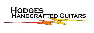
By the way, here is the new Hodges Handcrafted Guitars logo.


Simple, elegant, easily read. Perfect!


Author:  WaddyThomson [ Thu Aug 30, 2007 11:50 am ]
Post subject: 

Looks good, Ken.  Nice edge.  

Author:  KenH [ Sat Sep 01, 2007 6:32 am ]
Post subject: 

Now that I have that out of the way....


An explanation about the lightning bolt:


Over a decade ago, I purchased a 1957 chevy 2 door coup. It was white with flames on the side. I think it was my wife that came up with the idea of calling the car "White Lightning". I had a custom tag made for the front of the car with that on it.


I went to so may east coast classic car shows with the car that I became known as the "white Lightning guy"  . At 40 years old I actualy had a moment of indescression and had a tatoo placed on my arm that is a lightning bolt, very similar to what you see in my new logo. Seemed like a good idea at the time


Anyway, this logo was mainly meant to be used for the Ameritage cases I am having made. For those of you that have not called Nancy at Ameritage, I think you will be pleasantly surprised when you hear the offer she can make you on custom cases.


Thanks again for the referrals and links for logo makers. I am still talking with Dwight about designing labels and revamping my web page.


Author:  Jim Watts [ Sat Sep 01, 2007 8:19 am ]
Post subject: 

Looks good Ken.

Author:  Michael Dale Payne [ Fri Sep 07, 2007 7:23 am ]
Post subject: 

A little word of experience. First off I love the Logo. But from someone that has been there, ran into this issue and learned from it. You might want to use the full logo only on your makers label That much lettering on the peghead inlay will eat up a bunch of your peghead and you will have clients that will want adornments to the peghead that will both compete for space and conflict esthetically.

This is just my opinion but I would adopt the lighting bolt as your peghead inlay and use the entire logo only on the makers label, letter head and official documentation.

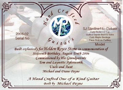
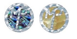
Here is what I do

Registered Logo

Makers label

1" dia. peghead inlays

Page 1 of 1 All times are UTC - 5 hours
Powered by phpBB® Forum Software © phpBB Group
http://www.phpbb.com/