Official Luthiers Forum! http://w-ww.luthiersforum.com/forum/ |
|
New brand and logo... http://w-ww.luthiersforum.com/forum/viewtopic.php?f=10102&t=7082 |
Page 1 of 2 |
Author: | John Elshaw [ Sun Jun 11, 2006 4:52 am ] |
Post subject: | |
Some of you may have recalled a couple months back that I was searching for help developing a logo. There were several folks here who kindly offered to help out, however this time I thought I would hire a pro to design the logo. I figured the logo is one of the main elements that helps identify a brand and will be shown on the website, brochures, business cards, guitars, etc., so I thought it was important to get right. With the recommendation of several folks on the forum, I went with Dwight Knowlton at 73ideas. He did an outstanding job designing the logo and making it mine. We went through many, many changes and alterations before arriving at the final design. He even created a brand new font for my signature that closely resembles my real signature, only much nicer and more legible. I know everybody has different opinions as to what looks nice--Dwight will work as many hours as needed to create your final vision. I was aiming for simple, but elegant. I think he did a great job of it and I am very happy with the results. If you're ever in the market for this type of work, I would give Dwight a call and see what he can do for you. The marketing and business side of guitar building is something we all could probably use a little professional help with. ![]() 
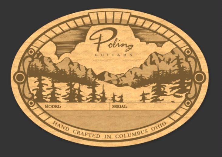
The pic above is the main logo for my future website, brochures, etc. The pic below also identifies the band, however the script portion of my last name will also be the portion that is inlaid on the headstock of my steelstring guitars. ![]() Cheers! John |
Author: | Jeff Doty [ Sun Jun 11, 2006 4:57 am ] |
Post subject: | |
John, Man that is classy. Not just saying that, I really think it is impressive. Dwight obviously knows what he is doing. Jeff |
Author: | Arnt Rian [ Sun Jun 11, 2006 5:01 am ] |
Post subject: | |
That looks very clean and professional, John. Money well spent for sure. I also use my own script on my heastocks, but I had to spend the better part of one evening and half a sketchbook before I was happy with my signature. Are you going to have your logos cut by someone else? |
Author: | Alain Desforges [ Sun Jun 11, 2006 5:07 am ] |
Post subject: | |
John, that looks AWESOME!!! Wow. Classy and very elegant, that will be recognizable for sure. Bravo! |
Author: | Kevin Gallagher [ Sun Jun 11, 2006 5:10 am ] |
Post subject: | |
John, That's one of the nicest logos I've seen....in any industry. Very nice and clean and easy to recognize at a glance. Regards, Kevin Gallagher/Omega Guitars |
Author: | charliewood [ Sun Jun 11, 2006 5:13 am ] |
Post subject: | |
I think that the script logos are pretty cool - having played lp's all my life I really got attached to the notion of script logos from way back when >lusting after my first les, and it continues til the present day. I think its more unique and much better than font logos like CFMartin, but thats just my opinion. Good job! Cheers Charliewood |
Author: | Brock Poling [ Sun Jun 11, 2006 5:20 am ] |
Post subject: | |
Dwight is great. He did my labels as well. I ended up with 3 designs that all work great. Here is one of them. The idea is this will be laser etched into wood. After seeing this. I should get him to take a look at my logo too. ![]() |
Author: | Andy Zimmerman [ Sun Jun 11, 2006 5:34 am ] |
Post subject: | |
John Very Nice I would use the top one to inlay in your headstocks |
Author: | peterm [ Sun Jun 11, 2006 5:46 am ] |
Post subject: | |
Very, very nice! Indeed one of the best ones I've seen! ![]() ![]() I don't know if you can share that kind of information but I'm sure many folks around here would like to have an idea how much something like that you cost? Approx... |
Author: | Bruce Dickey [ Sun Jun 11, 2006 5:58 am ] |
Post subject: | |
El KaHesh Columbo, hey, you are right! They are both great logos. Nice results John, I'd be very proud of that design too! Brock, yours is one of the nicest labels around, reminds me a tad of Collings. Never did understand what theirs meant? A flood in the shop washed the guitars downstream? Maybe it was a fire main broke???? |
Author: | James Orr [ Sun Jun 11, 2006 6:15 am ] |
Post subject: | |
I like it a lot. It's really nice. I especially like the script based version. The first does look a lot like Lance's. |
Author: | John Elshaw [ Sun Jun 11, 2006 6:37 am ] |
Post subject: | |
Thanks for all the positive comments fellas! As for the similarities to Lance's, I believe Dwight also created Lance's design, although I didn't realize how similar they were until it was posted above. I had over 30 different sketches and drawings to go through before choosing one. Some of the guidance I gave Dwight was to somehow incorporate my initials into the shape of a guitar. I was amazed at how many different ways that could be done. As I eliminated drawings a few at a time, we finally arrived at the logo above. I guess Lance has good taste also! ![]() Cheers! John |
Author: | Robbie O'Brien [ Sun Jun 11, 2006 7:16 am ] |
Post subject: | |
Beautiful logos John and Lance both. ![]() |
Author: | Dave Anderson [ Sun Jun 11, 2006 9:23 am ] |
Post subject: | |
That is really a cool logo. Think I'll give this guy a call! ![]() |
Author: | Billy T [ Sun Jun 11, 2006 10:16 am ] |
Post subject: | |
That'll Work for sure!! Classy |
Author: | James Orr [ Sun Jun 11, 2006 11:17 am ] |
Post subject: | |
I stop and look at the script logo every time I open the thread :) |
Author: | Jordan Bunte [ Sun Jun 11, 2006 12:05 pm ] |
Post subject: | |
That is really nice....I sketched something similar to that for mine a while ago. My initials are JB, so it is very much like mine. Too bad I don't have any guitars to sell yet. Argh. I think yours looks much nicer than mine though! Money well spent. Jordan |
Author: | rich altieri [ Sun Jun 11, 2006 12:29 pm ] |
Post subject: | |
very nice - A brand is a lifetime investment Looks like. You made a good investment in going to a pro for help |
Author: | Pete Harrington [ Sun Jun 11, 2006 12:53 pm ] |
Post subject: | |
Good looking logo John, makes a great avatar as well ![]() Pete |
Author: | MSpencer [ Sun Jun 11, 2006 1:43 pm ] |
Post subject: | |
Classy, I really like both designs and usages, I am going to check this guy out for sure. Mike White Oak, Texas |
Author: | Serge Poirier [ Sun Jun 11, 2006 4:53 pm ] |
Post subject: | |
Great logo and will be very easy to identify for future customers, well done! ![]() |
Author: | LanceK [ Sun Jun 11, 2006 11:25 pm ] |
Post subject: | |
Great looking LOGO John! AND Sig! I am working on, or I should say (Having someone work on) a new headstock sig for me. I still haven't settled in one a single design I like. Your is superb! As for my logo, I got lucky, my sister and brother in-law designed that for me, I have loved it since the first time I saw it, trouble has been finding a way to use it. I'm not happy with the way it looks on my headstock, I finally had it made into a tag that is glued to the face of my neck blocks, you can sorta see it in this image. It does a nice job of covering the neck bolts. |
Author: | John Elshaw [ Sun Jun 11, 2006 11:57 pm ] |
Post subject: | |
[QUOTE=LanceK] trouble has been finding a way to use it. I'm not happy with the way it looks on my headstock, [/QUOTE] I agree Lance, the shape of both our logos are not the best for headstock inlay. I think the reason is that it just doesn't look right to inlay a guitar shape on a guitar. That's why I'll be using my last name he created as my inlay. I do think our logos though are extremely nice for all other aspects of marketing because they identify the brand as a guitar, even when they are seperated from the guitar. It's kind of like a stamp you can put on anything related to your work. Do you use your logo on your regular labels? Cheers! John |
Author: | Miketobey [ Mon Jun 12, 2006 2:26 am ] |
Post subject: | |
Maybe the reason neither of you like the logos on the headstock is the fact that each is more full between the tuners and more slender in the area where there is actually more space on the headstock. Just my perception. This is not a criticism of the logos, but my view of how they relate to that part of a guitar. MT |
Page 1 of 2 | All times are UTC - 5 hours |
Powered by phpBB® Forum Software © phpBB Group http://www.phpbb.com/ |