Official Luthiers Forum! http://w-ww.luthiersforum.com/forum/ |
|
Inlay-Oh my aching eyes... http://w-ww.luthiersforum.com/forum/viewtopic.php?f=10102&t=8324 |
Page 1 of 1 |
Author: | 1bordeaux [ Tue Sep 05, 2006 2:39 am ] |
Post subject: | |
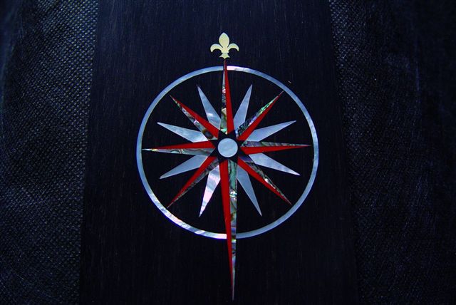
Here's a little eye candy... It's for the headstock and called a compass rose; just finished for a boat builder turned luthier! 28 pieces:Green heart ab, med. red coral, MOP, and gold MOP Fleur de lis. The large MOP circle was done on my CNC, mainly because it was simple. (Could have cut 15 by hand in the same time! ![]() Thanks for looking! Paul ![]() |
Author: | Don Williams [ Tue Sep 05, 2006 2:54 am ] |
Post subject: | |
cool.... |
Author: | Bobc [ Tue Sep 05, 2006 3:14 am ] |
Post subject: | |
Looks fantastic Paul. |
Author: | csullivan [ Tue Sep 05, 2006 3:33 am ] |
Post subject: | |
Paul, beautiful work, as usual. Lots of fitting where all those angles come together. You always manage to make me feel humble (or is that humiliate ![]() Craig S. |
Author: | JBreault [ Tue Sep 05, 2006 4:43 am ] |
Post subject: | |
Very cool! ![]() |
Author: | Brock Poling [ Tue Sep 05, 2006 4:47 am ] |
Post subject: | |
That rocks. |
Author: | Shawn [ Tue Sep 05, 2006 5:50 am ] |
Post subject: | |
Looks awesome...very well done. A minor artistic point (not meant to be negative in any way) and that is that the red coral is too far away from the green heart ab in terms of light value. If you squint at a piece of art to not focus on the colors but rather the light/dark of the composition you can see if the composition looks balanced. If instead of red coral you had used something that was had a lower light value and was closer to the value of the green heart ab such as turquoise or another stone that was of mid range value, it would appear more balanced. With the red being so dominant it draws attention and makes the star appear slanted to the left. I only bring it up as my wife is a professional artist who will occasionally wear sunglasses with red lenses so that the only thing that is seen is the values (light/dark) of the composition, not the colors used. I understand that before movies were color that costume designers would do the same thing...disregard the color as it was the light/dar4k balance that mattered. |
Author: | 1bordeaux [ Tue Sep 05, 2006 6:31 am ] |
Post subject: | |
[QUOTE=Shawn] Looks awesome...very well done. A minor artistic point (not meant to be negative in any way) and that is that the red coral is too far away from the green heart ab in terms of light value. If you squint at a piece of art to not focus on the colors but rather the light/dark of the composition you can see if the composition looks balanced. [/QUOTE] Shawn, I agree, but I was at the mercy of the customer, who gave a specific materials list. I appreciate the explanation; my wife has a degree in art history but usually answers the,"do you like it", with a simple yes or no ![]() Please continue with all critique, good or bad. I'm always willing to learn. ![]() Paul |
Author: | harry [ Tue Sep 05, 2006 6:35 am ] |
Post subject: | |
nice - will you repeat the theme on the fingerboard inlays? Maybe just the fleur-de-lis <SP>? |
Author: | Andy Zimmerman [ Tue Sep 05, 2006 6:39 am ] |
Post subject: | |
Very very nice. Both you and Craig do such incredible work!!! |
Author: | Dave Anderson [ Tue Sep 05, 2006 6:50 am ] |
Post subject: | |
I think it looks Mah-velous! I Really like the red coral with the abalone. Beautiful work Paul! |
Author: | Serge Poirier [ Tue Sep 05, 2006 7:08 am ] |
Post subject: | |
Great job Paul! ![]() ![]() ![]() |
Author: | 1bordeaux [ Tue Sep 05, 2006 7:30 am ] |
Post subject: | |
[QUOTE=harry] nice - will you repeat the theme on the fingerboard inlays? Maybe just the fleur-de-lis <SP>?[/QUOTE] The fingerboard is somewhat similar; I'll post some photos later this week, I hope! I just began coaching 7/8 yr.olds soccer again this week.I figure if I ask them to run the field, I'll get no complaints if I go first! I was wrong, my legs ARE complaining. ![]() |
Author: | Tom Morici [ Tue Sep 05, 2006 12:37 pm ] |
Post subject: | |
Impeccable work! I think the color combo makes it look like it is in motion. I like it! Tom |
Author: | Alain Desforges [ Tue Sep 05, 2006 1:22 pm ] |
Post subject: | |
Fabulous work Paul! |
Author: | LanceK [ Tue Sep 05, 2006 2:00 pm ] |
Post subject: | |
Sweet! |
Author: | Lillian F-W [ Tue Sep 05, 2006 2:22 pm ] |
Post subject: | |
Beautiful work and a beautiful compass rose. My brother as one that looks a lot like that one, but its on the back of his shoulder. |
Author: | Jim Watts [ Tue Sep 05, 2006 2:52 pm ] |
Post subject: | |
wow |
Author: | Anthony Z [ Tue Sep 05, 2006 5:29 pm ] |
Post subject: | |
That is tres cool! Fitting all those angles...ughh..with such a nice fit....you da man Paul |
Author: | Billy T [ Tue Sep 05, 2006 5:37 pm ] |
Post subject: | |
Outstanding! |
Page 1 of 1 | All times are UTC - 5 hours |
Powered by phpBB® Forum Software © phpBB Group http://www.phpbb.com/ |