Official Luthiers Forum! http://w-ww.luthiersforum.com/forum/ |
|
My new little logo http://w-ww.luthiersforum.com/forum/viewtopic.php?f=10102&t=9327 |
Page 1 of 1 |
Author: | Dave Anderson [ Wed Nov 15, 2006 9:36 am ] |
Post subject: | |
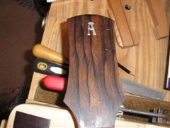
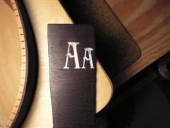
Hi guys, A while ago I posted my "A" logo for your comments.It turned out way too large.So here is my new smaller rounded logo that I like much better.What do you guys think? BTW- Thanks to Carlton for suggesting the rounded top of the A. ![]() Here's a comparison... ![]() |
Author: | Alain Desforges [ Wed Nov 15, 2006 9:41 am ] |
Post subject: | |
Yes! Very nice... I too like the smaller version with the rounded top... Very tasteful... ![]() ![]() |
Author: | Shane Neifer [ Wed Nov 15, 2006 10:38 am ] |
Post subject: | |
Looks Great Dave! By the way, the tops are on their way ![]() Shane |
Author: | CarltonM [ Wed Nov 15, 2006 2:54 pm ] |
Post subject: | |
Cool, Dave! I'm glad it worked out for you. |
Author: | Dave Anderson [ Wed Nov 15, 2006 2:57 pm ] |
Post subject: | |
Thanks guys, Yeah I'm happy with it now. Shane-Great!Can't wait to see em' ![]() |
Author: | Serge Poirier [ Wed Nov 15, 2006 3:00 pm ] |
Post subject: | |
Love it bud, sure will look more balanced! ![]() ![]() ![]() |
Author: | Lillian F-W [ Wed Nov 15, 2006 3:09 pm ] |
Post subject: | |
I would like to see it up against tuners, but.... from what you are showing, it looks really nice. Balanced in size and placement. Nice job Dave. |
Author: | BlueSpirit [ Wed Nov 15, 2006 8:22 pm ] |
Post subject: | |
Yep, the smaller one looks better. Nice job! |
Author: | Sam Price [ Thu Nov 16, 2006 12:01 am ] |
Post subject: | |
I also like the way the wood grain runs in the centre of the headstock and through the logo...very tasteful. |
Author: | Don Williams [ Thu Nov 16, 2006 12:33 am ] |
Post subject: | |
![]() Can anyone explain to me why my subconcious thinks the A should have little wings either side of it? |
Author: | CarltonM [ Thu Nov 16, 2006 3:40 am ] |
Post subject: | |
[QUOTE=Don Williams] ![]() Can anyone explain to me why my subconcious thinks the A should have little wings either side of it? [/QUOTE] "A" is for "Angel"? |
Page 1 of 1 | All times are UTC - 5 hours |
Powered by phpBB® Forum Software © phpBB Group http://www.phpbb.com/ |