Official Luthiers Forum!
http://w-ww.luthiersforum.com/forum/

Design critiques for the next guitar
http://w-ww.luthiersforum.com/forum/viewtopic.php?f=10123&t=36785
Page 1 of 1

Author:  Robert Renick [ Thu Jun 14, 2012 9:45 am ]
Post subject:  Design critiques for the next guitar

The last electric I made came out well for its purposes in my building evolution, now I would like to use a more original shape. This started as a Les Paul shape and turned into this. I like it, which is what scares me, I am better off in the shop then working the drawing board. I like the asymmetric waist and lower bout, but I am not sure it has the balance it needs. I am thinking of trying a copper veneer on the top and headstock:
http://www.veneersupplies.com/products/ ... -x-18.html
With that as a top, especially after Chris V's pics of the purfling magic, I am thinking a binding with about .040 cherry on the outside with a .020 maple on the inside. Bridge, knobs, and trim will follow the cherry maple theme similar to the last guitar, same electronics too. I will veneer the pickup with maple:
viewtopic.php?f=10123&t=36441
The fingerboard will be osage orange.
Thoughts, critiques and opinions, thanks for the help.
Rob

Author:  Robert Renick [ Thu Jun 14, 2012 11:53 am ]
Post subject:  Re: Design critiques for the next guitar

Thanks Chris, that is exactly the input I was after. The 16th fret lines up with the top of the upper bout where the selector switch is, 24 fret guitar, so as you like, I have a couple frets on the body.

So:
1: the kink is the easy part, I have an eraser to help with that
2: I do like subtle, to me it draws the eye in and get the brain into the "what's going on here" mode, but I agree, it is a little out, since I could not put my finger on it, I asked.
3: Is there a guiding formula for this ratio? Perhaps this is the change that will help even out the "mistake" look from #2
4: I will check that, good suggestion
5: Not totally sure what you mean on this, but I will figure it out when I get to the picture and play with it some more.
Thanks a lot, a big help, any thoughts on the copper veneer?
Rob

Author:  charliewood [ Thu Jun 14, 2012 1:59 pm ]
Post subject:  Re: Design critiques for the next guitar

I like it - while I agree with Chris that some refinement "may" be in order the general shape is quite neat....
Actually I feel its a bit reminiscent of Chris' design somewhat - I have to admit when I was dreaming up guitars a few years ago I came up with something similar to both this and Chris' design..(although mine is a little more Weiss'ish).
I think its sort of the natural evolution of what alot of us younger luthiers think the LP/Tele/(Strat) hybrid picture evens out to be in the end ..
I also have a personal take on the Yuriy Angel, mind you a little less flamboyant, and a lot less ornate.... anyone who has seen one will know what I mean...
Anywhere you end up on paper will only be a starting point anyway as you know - and ultimately the choice is yours... and when its in the build you can make refinememts also as you go..
I cant really comment on the copper top, Ive not thought about that too much... It wouldnt be something I personally would do - however there seems to be a surge in luthiers making metal guitars that arent Dobro/National style .... Travis Bean made quite a few I believe over the years .. then theres the Jackson Roswell ... and theres another maker of skinny waited LP styled instruments with quite an decorative tops on them for the most part(engraved and such),,,,but I cant quite remember the brand name right now... and a few others Ive seen in passing..
Who knows your finger may be on the pulse
Good Luck
Cheers
Charlie

Author:  alan stassforth [ Thu Jun 14, 2012 8:17 pm ]
Post subject:  Re: Design critiques for the next guitar

I like the shape.
I think the lower bout would look better if the bottom matched the top.
I bound a guitar with copper strips.
I roughed up the one side of it,
and used epoxy.
Use a file to trim the edges.
I used a belt sander,
and the heat made it pop loose.
The guitar is 17 years old with no problems.

Author:  Robert Renick [ Fri Jun 15, 2012 5:28 am ]
Post subject:  Re: Design critiques for the next guitar

Filippo Morelli wrote:
To Chris' observations of Marlin on paper - one thing to glean is - what you see on the screen or on paper is not real life.

One of the things I learned from studying Krenov's philosophy is that mocking up is hugely important. You might do well to get a cheap piece of wood and cut out your shape once you think you like it. Then you can play with it - smooth, change shapes, burn it, make another ... nice way to feel good about the shape instead of being knee deep in to a guitar before you realize it doesn't really give the same sense a drawing did.

I like what you are trying to do, btw. One thing I might encourage you to do: apply more imagination to your soundhole and tail piece. You have all these subtle design variations that feel very much like a play off an LP (but well executed to be differentiated), but when we get to the F hole and the tail piece they kind of look like they were stuck on there - they don't have the same modern creativity in design that you've done with the rest of the body.

Keep going! Looks good ...

Filippo

I worked on the drawing a bit more, came back and read Chris' post, and that is just what I gleaned from it. I just want to get to building and saw dust. So taking the advise, I will cut out the poster board, move to some 1/4" mdf, then 1/2 " ply make some changes on the way and get to work. I got a clue on this when I put the drawing on the screen, the flat spot Chris pointed out was barely noticeable on the drawing, but it was the first thing I noticed on the screen.

I agree the tail piece needs a design feature to tie it in, but the F hole, it needs a bit of refinement, but that is one classic shape that I feel I need to connect with on my lutherie journey. I had the opportunity to see and hold some original Cremonese instruments, the balance of the F hole shape, there is some magic there, and besides, it is note shaped so it is easier for the notes to come out through the hole :lol:
Taking your advise though, I think those refinements will come more easily when the mockups are more evolved. I very much appreciate the direction and encouragement.

For glue, Joe, has a product he sells with the veneer. http://www.veneersupplies.com/products/ ... esive.html

Allan, good tip, I could totally see myself belt sanding it, melting the glue, burning my finger, setting the bench on fire. . . . saved from all that mess with a simple tip on the OLF.

Chris, I did move the cutaway u a bit, I made the upper bouts a bit bigger, and exaggerated the asymmetry a bit more, right off off of the paper, I can't tell if it is an improvement though. Thanks for the tips on the Marlin experience, you saved me some frustration, thanks Charlie as well, your message was similar. I really have no idea why I like the copper top idea, but it is talking to me, and I just got a big ol' vacuum pump that I want to try.

3 AM, fell asleep reading my kid a story again. [xx(]
Thanks again everyone.

Author:  Steve Davis [ Fri Jun 15, 2012 7:28 am ]
Post subject:  Re: Design critiques for the next guitar

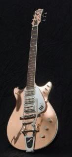
Reminds me a bit of this
Attachment:
P1040583 (640x428).jpg

I like the guitar, its a bit neck heavy and will not sit in a regular guitar stand.

As for yours Im with Filipo on experimenting with f hole alternatives
I like it though!

Author:  Dave Stewart [ Fri Jun 15, 2012 8:00 am ]
Post subject:  Re: Design critiques for the next guitar

verhoevenc wrote:
Definitely getting better! It's amazing what slight changes can do 'eh? There still appears to be a flat spot in the lower ...

This is why, if you're into this, I strongly recommend working in CAD. (In this case, you'd make a half pattern, "mirror copy" about a centerline, and the "kink" issue doesn't happen...you're confident everything's perfectly symmetrical as your starting point.) You can make dozens of subtle mods (eg insert a variety of cutaway shapes 'till one jumps out) without a lot of redrawing or loss of a gem due to erasing. And the slight changes can be huge, so you're much more likely to get what you want off cad than a hand drawing IMO, because you can then print full scale & use that as a pattern. Many cheap programs out there.

Author:  Robert Renick [ Fri Jun 15, 2012 9:44 am ]
Post subject:  Re: Design critiques for the next guitar

Dave Stewart wrote:
This is why, if you're into this, I strongly recommend working in CAD

Nag me about losing 20 pounds while you are at it. You are right, as I have been doing this I have been grumbling to myself, just learn CAD already. I have been needing to for a long time, and I will have to do it some day, so very soon I will take the plunge.

Steve, very nice guitar, the mottled figure is similar to the copper I am thinking of. It is interesting seeing yours how the waist difference changes the look so much.
Rob

Author:  cphanna [ Fri Jun 15, 2012 6:08 pm ]
Post subject:  Re: Design critiques for the next guitar

From a purely visual perspective, I think the shape of the f-hole is very dated. It reminds me of very traditional vintage archtop acoustic guitars of the '30s and '40s. Not that there is anything wrong with that. It's purely a visual thing with me. The rest of your design seems very contemporary and you asked for our input so I offer mine freely. I think you've got the basis for an exciting instrument here. If it were mine, I'd design a sound hole with a more contemporary shape. I don't know how to tell you what that is, but you'll find dozens and dozens of photos if you google search a little, and you will find inspiration.

But, of course, it's not my guitar. It's yours. So if you really prefer that particular shape then I think you should go with it.

We will all want to see it when it's finished, so please follow up. Good luck with it!

Patrick

Author:  muskr@ [ Fri Jun 15, 2012 6:21 pm ]
Post subject:  Re: Design critiques for the next guitar

Overall, I really like the design. It has a interesting sort of retro contemporary look that I've come to appreciate.
In the second version, it looks like the tapered look of the horn was lost when you adjusted the cut away, leaving it looking sort of square. I think that might be worth trying to fix while retaining the added fret access. Personally, I like the amount of offset in the lower bout.
Did I catch that you were a teacher? You can get autoCAD student version free if you are a student or teacher. I'm still in high school, so I got it and the only difference is that it prints with a watermark.

Author:  Shaw [ Fri Jun 15, 2012 10:36 pm ]
Post subject:  Re: Design critiques for the next guitar

I agree with Chris on the flatness part on the one side but things don't always have to be symmetrical to look good....Mike

Author:  Robert Renick [ Sat Jun 16, 2012 9:44 am ]
Post subject:  Re: Design critiques for the next guitar

muskr@ wrote:
Overall, I really like the design. It has a interesting sort of retro contemporary look that I've come to appreciate.
In the second version, it looks like the tapered look of the horn was lost when you adjusted the cut away, leaving it looking sort of square. I think that might be worth trying to fix while retaining the added fret access. Personally, I like the amount of offset in the lower bout.
Did I catch that you were a teacher? You can get autoCAD student version free if you are a student or teacher. I'm still in high school, so I got it and the only difference is that it prints with a watermark.

Thanks for that, I knew something went out with the horn, but I was not sure what, I will play with that. I am new to teaching so I did not know that there was a free school version, which means there may be a version waiting for me at school.
I worked that lower bout a bit more, it looks much better.
I will keep an open mind on the F hole, I have some time before I need to make that, hopefully something will come to me for the f hole and the tail piece that will add to that "contemporary retro" feel that this has. Perhaps the bottom of the f hole keeps the tradition while the top gets an update.
Thanks again for the pointers, I would not come up with all of these observations myself.
Rob

Author:  Robert Renick [ Sat Jun 16, 2012 1:30 pm ]
Post subject:  Re: Design critiques for the next guitar

Was led to this over on the AGF:
http://www.schecterguitars.com/Products ... m-E-A.aspx
Pretty similar, looks balanced, but almost too subtle, lacks some pop or sizzle to my eye, but likely has a broader appeal. Looking at this also makes me like the copper idea more, as it will separate the look from anything factory. I will be doing 2 guitars at once from the same neck blank, the Prince and the Pauper, the Prince will get the copper, the Pauper will be plain, both will be the same but for the final trim.

Author:  turmite [ Sat Jun 16, 2012 8:37 pm ]
Post subject:  Re: Design critiques for the next guitar

While Rhino 3d is not free, there is a very inexpensive educational version available, and should you decide to ever do 3d surface modeling, Rhino rocks! There is a free download of Rhino that gives you 20 saves. Try that and see if you like it.

Mike

Author:  charliewood [ Thu Jun 28, 2012 2:05 pm ]
Post subject:  Re: Design critiques for the next guitar

Comfy
I found you an example of a copper topped guitar by Parsons - A very cool article in premier guitar magazine - Aug 2010 - the online version is free to view in pdf - they have many many cool luthier profiles on there which is why I like reading the magazine - also I really like that they have a free digital edition and you can view all the back issues as well!!
Here it is
Jack White owns this and other Parson's
Image
Cheers
Charlie

PS here is the link to the issue I spoke of
in case youd like to read the whole article
http://digital.premierguitar.com/premie ... 1?fm=2#pg2

Author:  Robert Renick [ Fri Jun 29, 2012 3:24 pm ]
Post subject:  Re: Design critiques for the next guitar

This is the wild stuff I have in mind, I will have vacuum parts from Joe's come today, but the copper was not on the order, it will have to wait for another payday.

Page 1 of 1 All times are UTC - 5 hours
Powered by phpBB® Forum Software © phpBB Group
http://www.phpbb.com/